Rethinking national identity: rebranding croatia airlines
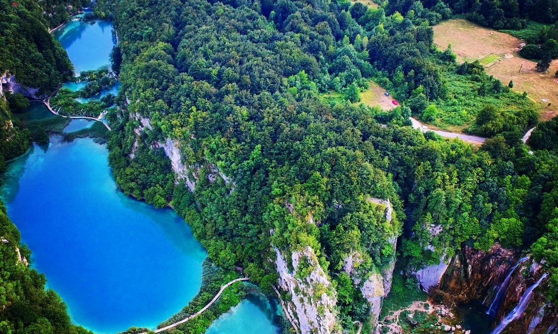
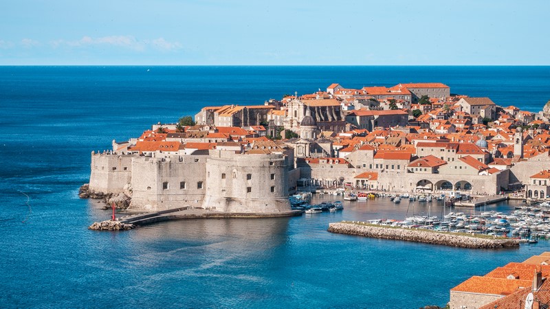
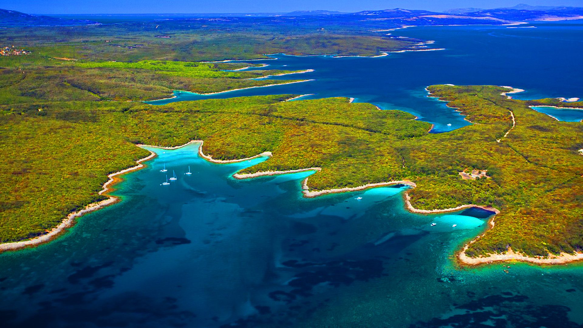
Croatia has become in recent years a prime touristic destination in Europe and the World. It is known for it's pristine beaches, rich culture and more recently, it's gastronomy. It's popularity has grown exponentially mainly due to it's attractive island destinations and heritage sites, such as the Plitvice lakes, the City of Dubrovnik and Split. But under the radar, many other places have morphed from transitional places to longstays. One of these examples is the city of Zagreb, which now offers many sites and attractions year round as while as a growing international student population. This year, the City of Zagreb opened a brand new modern and functional terminal which happens to also be the home of it's national carrier, Croatia Airlines

Photo: Arch2O
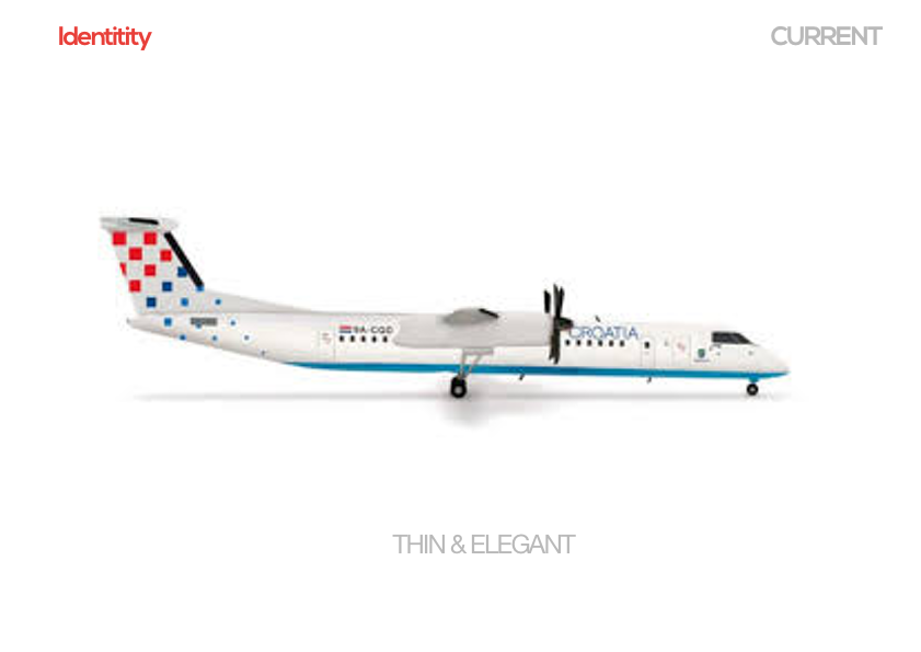
Croatia Airlines, despite being a very small, even regional carrier remains the national carrier for the country of Croatia. Like most "Legacy" airlines, it is currently struggling with increased competition in Europe, and even it's own soil, notably from low cost Airlines such as RyanAir and Easyjet.
CURRENT REPRESENTATION

GOAL
THE OBJECTIVE OF THE REBRAND WAS AN EXCERCISE TO RETHINK IT'S IDENTITY, NOT ONLY AS AN AIRLINE BUT TO REPRESENT CROATIA AS A COUNTRY. THIS SHOULD BE A NATIONAL CARRIERS' RESPONSIBILITY. FOR VISITORS, IT IS OFTEN THE FIRST CONTACT WITH A NATION. FOR NATIONALS, IT IS WHAT TAKES THEM FROM AND BACK TO THEIR HOME. THIS PROJECT WAS INTENDED TO QUESTION MANY THINGS; DOES A NATIONAL CARRIER NEED TO CARRY IT'S FLAG'S COLORS ? IF NOT, WHAT DO THOSE REPRESENT. WHAT IMAGE DOES THE BRAND CARRY. VISUALLY AND EXPERIENCE-WISE? WHAT ELSE CAN IT BE? WHAT CAN IT BECOME? HOW DO WE WANT PEOPLE TO PERCEIVE IT?
ICONOGRAPHY AND INSPIRATION


EARLY STUDIES


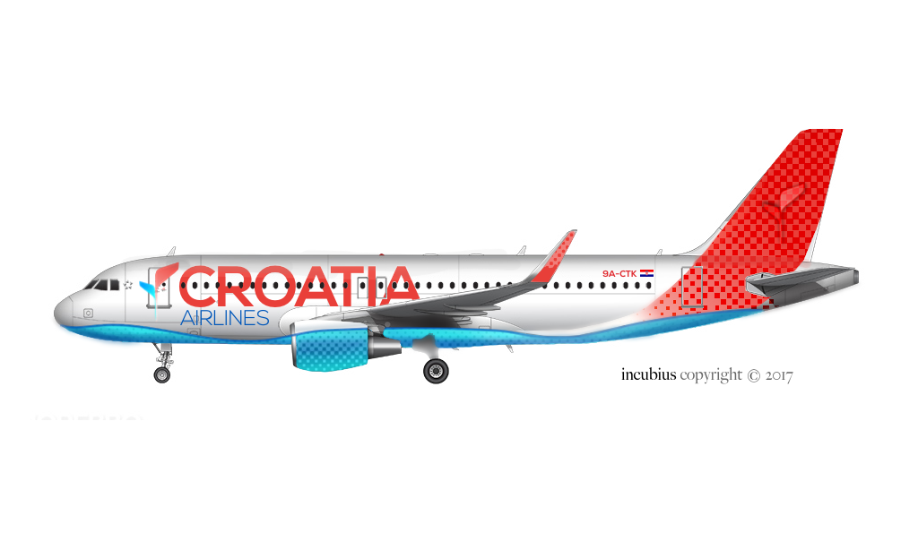
Tail design
The first iteration of the Croatia Airlines tail design had the recognizable checkered pattern present with a blue triangle. In it's current iteration, it has dispersed, colored squared in different tones of red and blue. Although not immediately obvious, it's supposed to pay an hommage to the checkered pattern and the "dots" representing the more than 1000 islands in Croatia.
The complexity of blending and using the flag colors, red-white-blue was quite challenging. Different options were looked at in terms of what could be represented. Ultimately, the color bands were chosen to representent two important facets; Continental and Coastal Croatia. We opted for an intentionally large coloured band going from the fuselage to the tail.

Design
Different possibilities were tested for the tail design including: a logotype, name or abbreviation, and different symbols representing either the airline, country or cities/places. Also, different patterns were tested.

Continental and coastal croatia
Ultimately, a pattern consisting of two shapes was chosen. One running at the bottom of the fuselage, reminiscent of the turquoise tones of the Adriatic and the other from the fuselage to the tail honoring the now famous red and white checkered pattern.
NEW LIVERY proposal- Croatia Airlines

CROATIA AIRLINES A320 W/ SHARKLETS- NEW LIVERY - BELLY

The belly of the plane, like it's predecessor, is painted in a contrasting color. Intentionally swaying away from the blue found in the Croatian flag, this tone is meant to resemble the turquoise waters of the Adriatic, which represents strongly the country, in terms of tourism but also natural beauty. The middle is a "splash" in which Croatia is display, to be visible from the ground.